It’s time to freshen up your social media and give your brand a new look this season with unconventional color combinations and vivacious palettes!
The power of color lies in human emotion – how we react to warmth or coolness, how we perceive bright hues or muted shades, how we think and feel when we see a harmonious blend of colors versus a contrasting palette.
Color has been scientifically proven to have a significant impact on our mental and physical health, each color being able to evoke a specific emotion or tell a certain story. For instance, Pantone’s Ultimate Gray is emblematic of stability and familiarity, whereas Illuminating symbolizes positivity and hopefulness. When you utilize these colors in your branding, you’re essentially telling a story.
So, without further ado, let us take a look at some of the hottest 2021 color trends that are bound to make your brand stand out!
1. Fruity Vibrance

Images from 123RF. Collages created with Designmaker, Designs.ai.
This delectable palette is an instant mood booster as it can literally brighten up any space and elevate any look.
With a punch of vibrant orange, a shocking squeeze of lime, a fun burst of apricot and a splash of cerulean blue, this palette definitely takes the art of color-blocking to new heights.
We think this color palette works best with beauty products, maximalist fashion brands and eclectic art accounts. But even if your business isn’t in any of these industries, you can still give this bold look a try!
2. Candy Pastels

Images from 123RF. Collages created with Designmaker, Designs.ai.
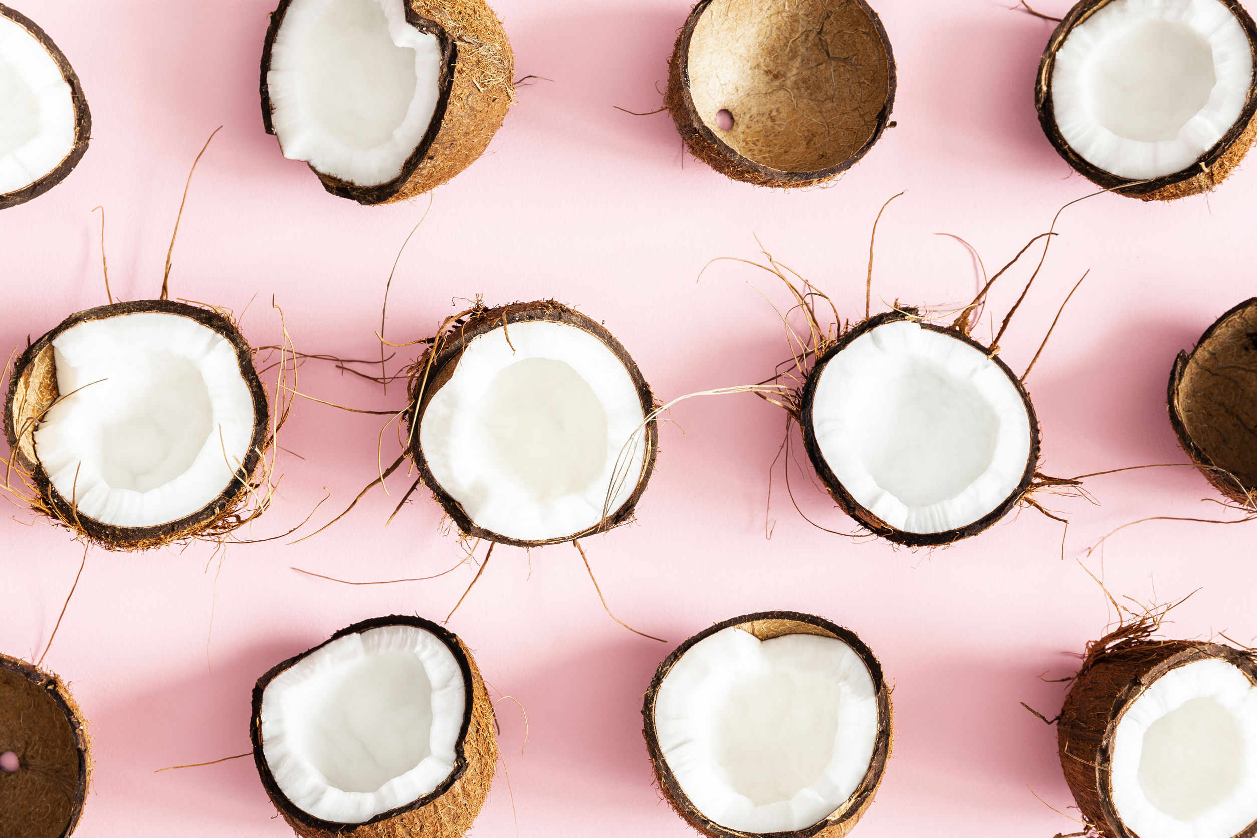
Soft and sugary, delicate and delicious. We all love pastel colors, don’t we? But what exactly is pastel?
Pastels, also known as tints, are pale tones of colors created by mixing a significant amount of white into the original shade. For instance, if you mix white with red, you’ll get pink, one of the most popular pastel colors. The more white you mix into it, the lighter the pink becomes.
When people see pastels, one of the first things they instinctively think of is spring! This is mainly because most spring flowers, such as cherry blossoms, come in pastel shades. And what do people associate with spring? Happiness, hope and new beginnings!
However, pastels are not for all brands. Let me give you an example: pastels would be the ideal choice for a maternity boutique, a cupcake bakery or a lifestyle blog for millennial women, but they would seem painfully unfitting for, let’s say, an outdoor sports store that sells sturdy hiking gear. So before you incorporate pastel colors into your palette, make sure they are in line with your industry, business and overall branding.
3. Subdued Spring

Images from 123RF. Collage created with Designmaker, Designs.ai.
Reminiscent of spending a rainy afternoon cocooned in blankets, evocative of having coffee and brunch at a quaint seaside cafe. Soothing to the eye and soul, this color palette strikes the perfect balance between warm and cool tones.
These muted colors are rather similar to pastels as they are the opposite of bright, vivid and saturated colors. But instead of being mixed with white, these tones are created by adding gray (equal amounts of black and white) to pure colors. Hence, they are duller and less saturated compared to pastel colors.
According to color psychology, subdued colors evoke a sense of calm, nostalgia and security. Many home decor and furniture brands have started translating these emotions into their design and leveraging these colors in their marketing campaigns.
4. Illuminating Gray

Images from 123RF. Collages created with Designmaker, Designs.ai.
As 2020 came to an end, Pantone announced their two colors of the year 2021 – Ultimate Gray and Illuminating. A seemingly odd pairing of dim gray and bright zesty yellow. But its appeal is actually in its stark contrast.
In this palette, Illuminating acts as the accent color that can be used in small doses, sprinkling sunshine onto the otherwise somber scheme of Ultimate Gray. Though it may seem like a slapstick act, this color palette actually carries a meaningful message of positivity and fortitude.
Various brands have begun incorporating this color palette into a wide range of projects, ranging from web and graphic design to product packaging and photography.
5. Neon Sorbet

Images from 123RF. Collages created with Designmaker, Designs.ai.
Upbeat, euphoric and fashion-forward. There’s no way you can scroll past these candy-like neon tones and ignore their fizzing energy.
Yes, this color palette is the complete opposite of Subdued Spring. Yes, this palette can be overt and a little in-your-face. But when leveraged correctly, this high-octane color palette can make an impactful statement in your websites, landing pages, banner ads and even social media posts. When applying these playful colors to your design, you can balance them out with either black or white to make your overall work less garish.
Live Colorfully
Color is a powerful tool. If you know how to leverage it, you can bring positive energy to your projects, you can inspire your audience, you can spark joy and creativity. The possibilities are endless. Live life in color today!
For more beautiful spring colors, check out our specially curated spring collection.
This article was first published on https://blog.123rf.com/5-spring-2021-color-palettes-to-help-your-brand-stand-out/


