As 2020 was coming to a dramatic end, Pantone announced their two colors of the year 2021 – Ultimate Gray and Illuminating. An unlikely pairing of dull but familiar grey and bright zesty yellow.
Goodbye Gray Skies, Hello Sunshine
It is a story of color that encapsulates steadiness and strength amid uncertain times with the promise of something sunny and hopeful.
Ultimate Gray is emblematic of solid and dependable elements, such as comfy bed linens, gravity blankets, sidewalk cement, dimly lit rooms and cloudy days perfect for sleeping in. The color gray evokes our collective experience over the past year, our time spent at home in isolation devoid of social gatherings and human touch.

Contrarily, Illuminating is the bright yellow of lemon skin, brimming with vivacity and warmth. The yellow shade, imbued with solar power, symbolizes the light at the end of a long tunnel, the sun rising over a post-pandemic world in deep slumber, the dawning of hope that comes with the delivery of a vaccine.

Though the “Colors of The Year” is generally meant to be a trend forecast, the 2021 colors are becoming increasingly metaphorical as different brands begin to incorporate them into their marketing message for the year.
So, without further ado, here are some ways you can hop on the color trend and use it in various creative outlets!
#1 Food Styling & Food Photography

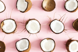
When creating flat lays, most food stylists and photographers would place vibrantly colored food against plain backdrops in order to strike a balance between the dull and the bright. For instance, bright yellow confections or fruit laid on a gray patternless kitchen countertop immediately stand out.

#2 Interior Design

Gray walls, gray pillows, gray comforters, but with a pop of yellow! Adding some bright yellow furniture to a monochromatic space makes all the difference in the world, especially when one spends most of his/her time being cooped up within those walls.

#3 Product Marketing

In marketing and branding, color psychology focuses on how colors impact consumers’ impressions of a brand and their subsequent purchasing decisions. According to research, up to 90% of snap judgments made about products are based on color alone.
A pair of gray sneakers represent balance, but gray sneakers with striking accents of yellow give off a sense of stability and optimism. Now, imagine seeing those sneakers on an ad along with the campaign tagline “Down to win, down for fun.”

#4 Graphic Design & Web Design

Minimalism has been taking over as one of the top brand design trends over the past few years, and it’s not going away anytime soon.
Many creatives have combined this year’s color trend with timeless, fuss-free minimalism in their designs. From the marriage of gray lines and yellow waves to the abstract 3D design of gray cubes splattered with yellow paint.

A Message of Positivity & Fortitude
Check out our Colors of 2021 collection for more relevant stock content.
With all that has happened and all that is still happening around the world, what we need is something bright and good to look forward to – hope is the essence of the human spirit.
This article was first published on https://blog.123rf.com/colors-of-2021-how-to-leverage-the-color-trend/


